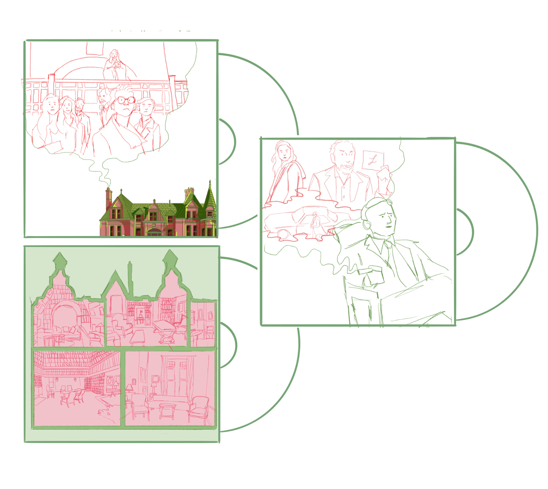
Knives Out Movie Poster
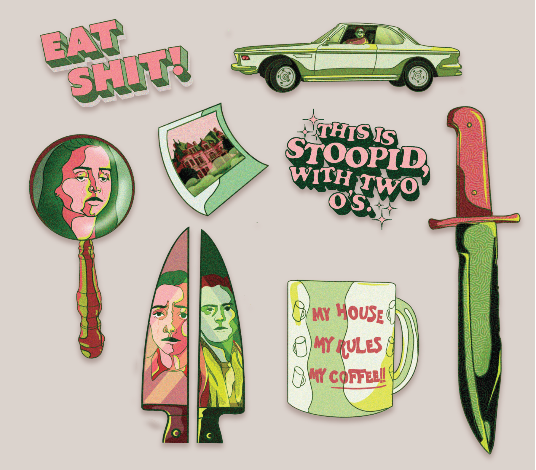
Sticker

Inside vinyl sleeve
Vinyl Packaging
Process
Early in the process, the idea of a limited color palette interested me, because I wanted to
challenge myself. Green was utilized to reference the greed/envy in some characters, and
pink for the innocent/honorable ways of others. Keeping in mind the color palette of the
poster, the merchandise design did not deviate from that. When developing the merchandise,
the development of vinyl which is an outdated object seemed adequate for the ambiance of
the movie. Since Knives Out is modeled after old-school murder mysteries.
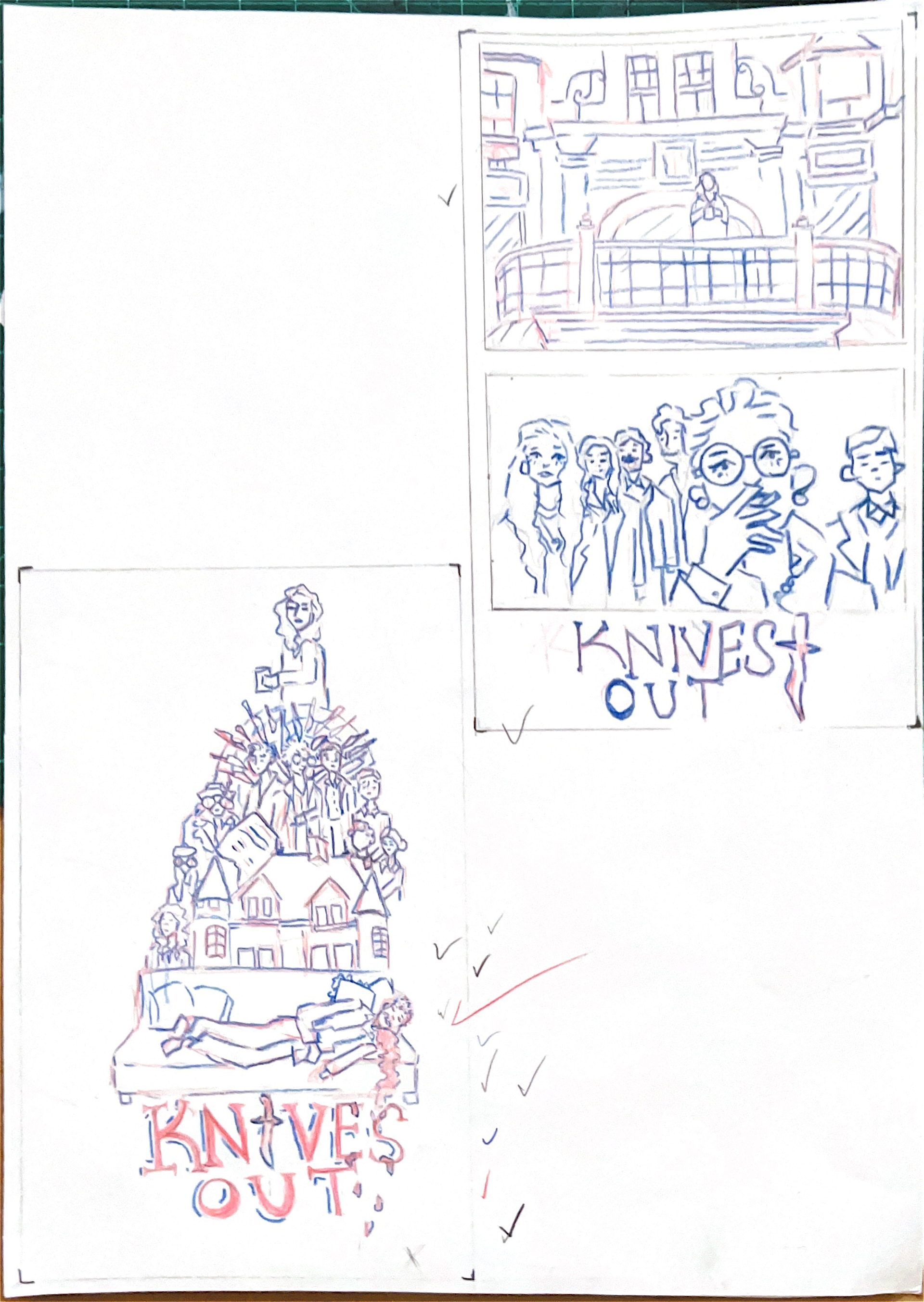
Poster Concept Development
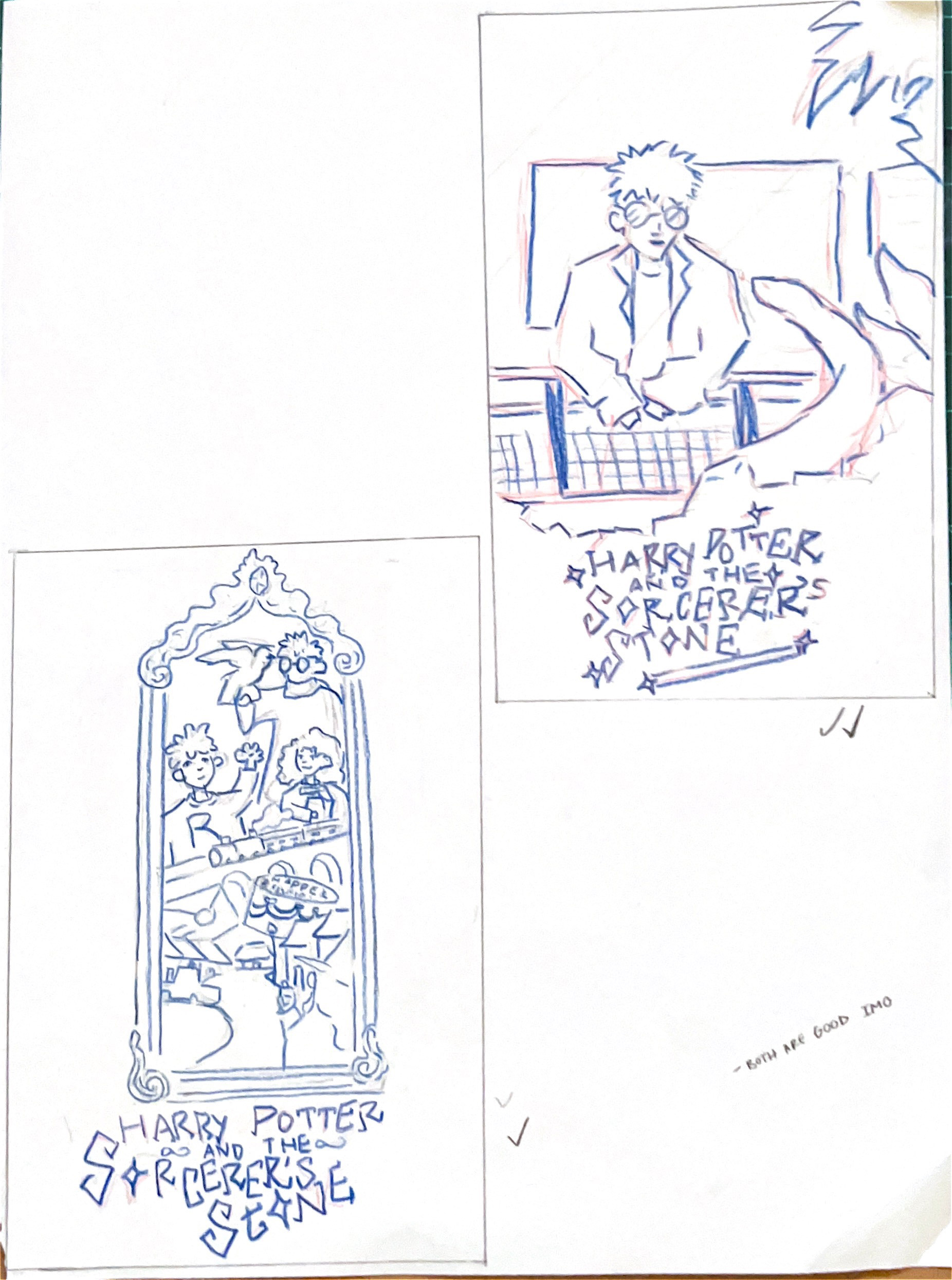
Poster Concept Development
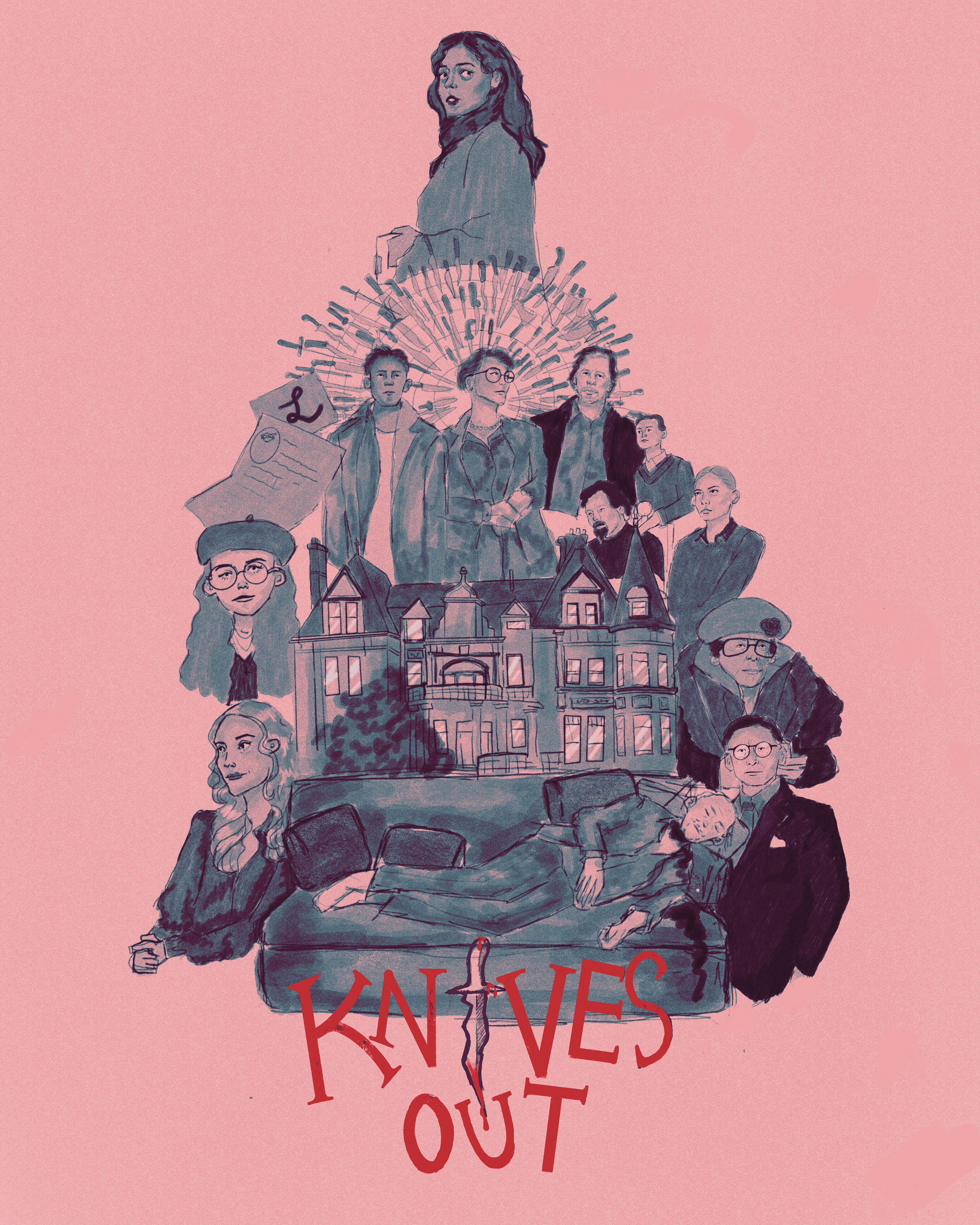
Poster Draft

Poster Draft
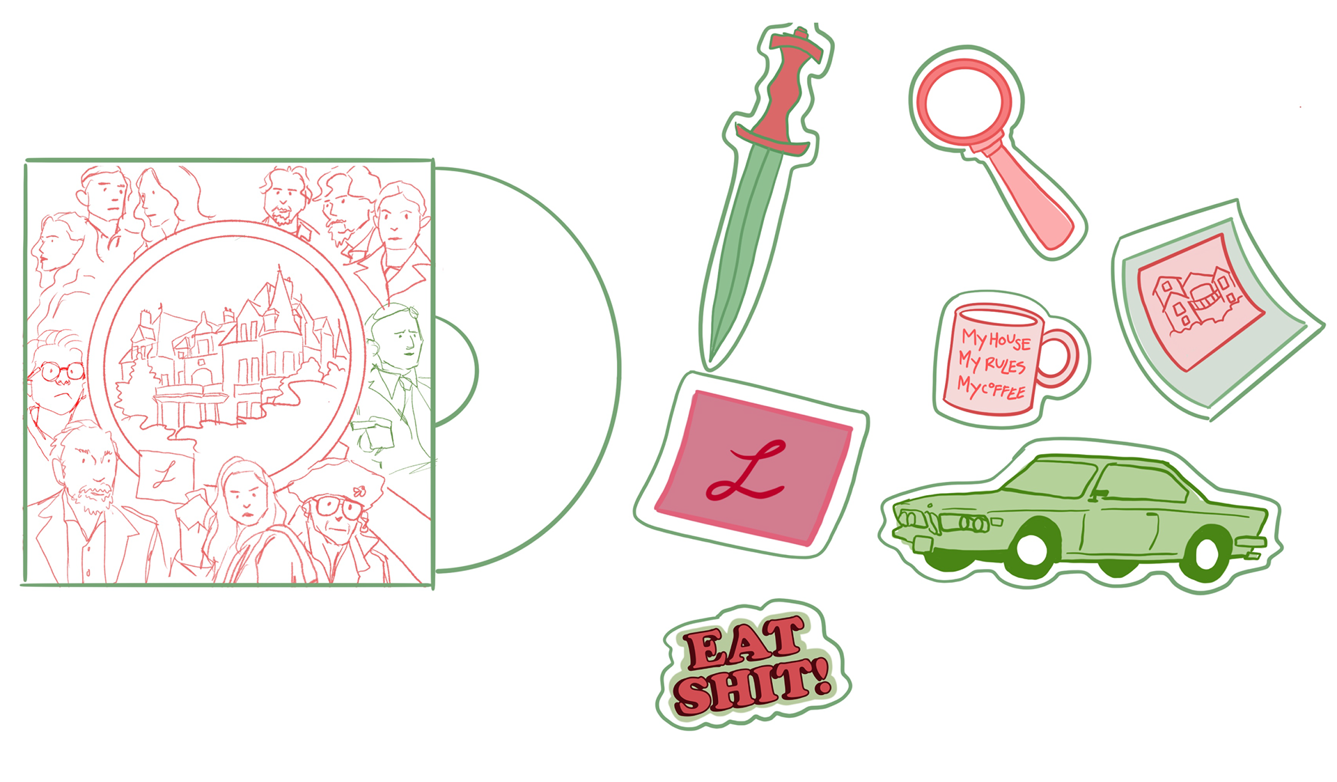
Vinyl and Sticker Drafts
